Typography Style Guide: The Essential Resource for Web Designers
Typography Style Guide: The Essential Resource for Web Designers
Why Typography Makes or Breaks a Website Studies show users form an opinion about a website's credibility within 50 milliseconds — and typography is the dominant factor. Poor type choices signal amateur execution; excellent typography signals authority and builds trust before a single word is consciously read. Best suited for: web designers, front-end developers, product designers and anyone responsible for a website's visual language. Work with Our Design Team →
Typography is the discipline we return to most consistently at Modern Web Design. After 750+ projects, we have developed strong opinions about what works on the web. This guide is our complete reference.
Table of Contents
- Typography Fundamentals for Web
- Choosing Typefaces for the Web
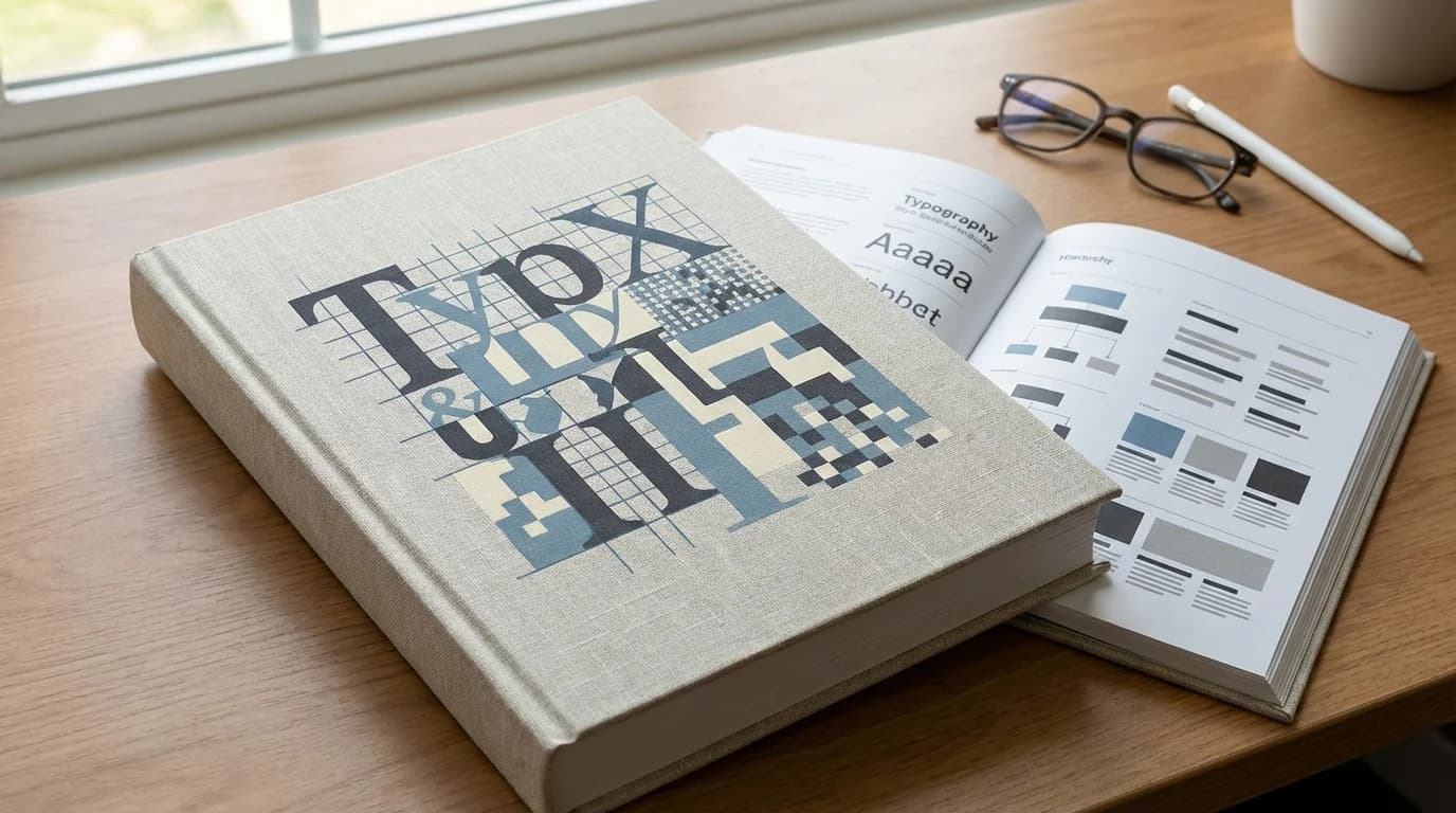
- Type Scale and Hierarchy
- Font Pairing Principles
- Line Length, Height and Spacing
- Responsive Typography
- Variable Fonts
- Typography and Color Contrast
- Typography for Accessibility
- Typography in Design Systems
- Performance Considerations
- Common Typography Mistakes
- Conclusion
Typography Fundamentals for Web {#fundamentals}
Web typography differs from print typography in critical ways:
- Variable rendering: Text renders differently across operating systems, browsers and display technologies. What looks crisp on a Retina MacBook may look different on a budget Android screen.
- Interactive states: Links, buttons and form labels require typographic treatment for hover, focus and active states.
- Dynamic content: Real user content varies in length; typography must accommodate this variation gracefully.
- Performance constraint: Every typeface is an HTTP request; type choices have direct performance implications.
- Accessibility requirement: Text must meet contrast ratios and size requirements for all users.
The Three Typographic Roles on the Web
Display Type: Large headings (H1, hero text) where character and impact matter more than optimal readability. Can tolerate tighter tracking and more distinctive faces.
Text Type: Body copy where readability at normal reading sizes is the primary requirement. Should be comfortable at 400-500 words per session minimum.
UI Type: Labels, buttons, navigation and captions. Requires clarity at small sizes and consistent rendering across interactive states.
Choosing Typefaces for the Web {#choosing-typefaces}
Sources for Web Fonts
Google Fonts — Free, extensive library, privacy-safe self-hosting available. Quality varies; top-tier options include Inter, Plus Jakarta Sans, DM Sans, Lora, Source Serif 4.
Adobe Fonts — Premium quality, included with Creative Cloud. Larger library, higher average quality ceiling.
Fontshare — High-quality free fonts from Indian Type Foundry. Underused and therefore differentiated.
Commercial Foundries — Klim Type, Grilli Type, Commercial Type offer distinctively crafted typefaces that signal premium investment.
Evaluation Criteria
When evaluating a typeface for web use, test:
- Legibility at small sizes: How does it read at 14-16px?
- Spacing and rhythm: Does it set well in paragraphs, not just headlines?
- Character set completeness: Does it include all characters you need (currencies, diacritics, special characters)?
- Weight range: Does it have the weights your hierarchy requires (at minimum: regular 400, medium 500 or semibold 600, bold 700)?
- Variable font availability: Is a variable font version available for performance and animation?
- Rendering across platforms: Test on Windows Chrome (ClearType), macOS Safari (CoreText) and Android Chrome.
Type Scale and Hierarchy {#type-scale}
A type scale is a set of predetermined sizes that create visual harmony and clear hierarchy. Using arbitrary sizes creates visual noise; a systematic scale creates order.
Modular Scale Ratios
Common ratios for web type scales:
| Ratio | Name | Effect |
|---|---|---|
| 1.067 | Minor Second | Subtle, compact hierarchy |
| 1.125 | Major Second | Moderate hierarchy, dense UIs |
| 1.250 | Major Third | Clear hierarchy, typical for web |
| 1.333 | Perfect Fourth | Expressive, good for content sites |
| 1.500 | Perfect Fifth | Dramatic, best for large displays |
For most web projects, we use a Major Third (1.25) or Perfect Fourth (1.333) scale.
Example Scale (Perfect Fourth, base 16px)
| Token | Size | Usage |
|---|---|---|
text-xs | 12px | Captions, footnotes, legal |
text-sm | 14px | Secondary labels, meta info |
text-base | 16px | Body text |
text-lg | 18px | Lead paragraphs, large UI labels |
text-xl | 21px | H4, card titles |
text-2xl | 28px | H3, section headings |
text-3xl | 37px | H2, major headings |
text-4xl | 49px | H1, hero headings |
text-5xl | 66px | Display type, hero headlines |
Hierarchy Beyond Size
Size alone is insufficient for hierarchy. Support it with:
- Weight: Bold draws the eye before light
- Color: High-contrast text reads as more important
- Spacing: More space around an element increases its perceived importance
- Case: ALL CAPS signals a different category of information (use sparingly)
Font Pairing Principles {#font-pairing}
Font pairing is one of the most asked-about topics in typography. The principles are simpler than most guides suggest.
Rule 1: Establish Clear Contrast
Two similar typefaces fight each other. Pair typefaces with clear differences:
- Serif + sans-serif (classic, reliable)
- Geometric sans + humanist sans (subtle contrast, works well for UI-heavy projects)
- Display serif + neutral sans (editorial, authority)
Rule 2: Shared DNA
Pairs work best when they share some quality — a similar x-height, a related design era, or faces from the same designer. This is why "superfamily" typefaces (families with both serif and sans variants) often pair so naturally: Lora + Source Sans, IBM Plex Serif + IBM Plex Sans.
Rule 3: Assign Clear Roles
Assign typefaces to distinct roles rather than competing uses:
- Typeface A: All display/heading use
- Typeface B: All body/UI use
Never use both typefaces at the same size for different content — it creates confusion rather than hierarchy.
Proven Pairings for 2025 Web Projects
- Inter + Lora: Neutral UI + authoritative editorial. Excellent for content-heavy sites.
- Plus Jakarta Sans + DM Serif Display: Modern brand + expressive headlines. Good for agencies and startups.
- DM Sans + DM Serif Text: Same family, maximum harmony. Safe and professional.
- Satoshi + Fraunces: Contemporary + distinctive. Strong brand differentiation.
Line Length, Height and Spacing {#spacing}
Optimal Line Length
The optimal line length for comfortable reading is 50-75 characters (including spaces). This is approximately:
- 600-700px container width at 16px/18px body text
- Approximately 12-15 words per line
Lines that are too long force excessive eye travel and cause users to lose their place. Lines that are too short fragment reading rhythm. Both increase reading effort and reduce engagement.
Line Height
Line height (leading) should be proportional to line length and type size:
- Body text: 1.5–1.6 (24-26px at 16px base)
- Headings: 1.1–1.3 (tighter, as short lines need less leading)
- Long-form content: 1.6–1.8 for maximum readability
Paragraph Spacing
Spacing between paragraphs should be greater than line height to clearly separate chunks of thought. A common approach: margin-bottom: 1.5em on paragraphs (1.5× the current font size).
Letter Spacing
- Body text: Never track body text negatively; slight positive tracking (0.01-0.02em) can improve readability at small sizes
- Headings: Slight negative tracking (-0.02 to -0.03em) at large sizes improves visual tightness
- ALL CAPS: Always add positive letter spacing (0.05-0.1em) — all-caps text reads poorly without it
Responsive Typography {#responsive}
Typography must adapt to viewport size. There are two approaches:
Breakpoint-Based Scaling
Define type sizes at each breakpoint: // Code example (css): :root { --text-4xl: 36px; } @media (min-width: 768px) { :root { --text-4xl: 48px; } } @media (min-width: 1280px) { :root { --text-4xl: 64px; } }
Simple, predictable, well-supported.
Fluid Typography with clamp()
// Code example (css): h1 { font-size: clamp(2rem, 4vw + 1rem, 4rem); } This smoothly scales the H1 from 32px (2rem) at minimum to 64px (4rem) at maximum, based on viewport width. No breakpoints needed for typography. This is our preferred approach for headings.
Typography Breakpoint Considerations
- Mobile: Tighter line height, larger relative font sizes for headings (headings should not dwarf body on small screens)
- Tablet: Intermediate scale
- Desktop: Full scale with optimal line lengths
Variable Fonts {#variable-fonts}
Variable fonts contain multiple variations (weight, width, optical size) in a single font file. This is a significant development for web typography:
Performance benefit: One variable font file instead of 4-8 separate weight files. Typical savings: 60-80% fewer HTTP requests; file size usually smaller than the combined static files.
Design benefit: Any weight along the variation axis is available, not just pre-defined weights. Animate font weight on hover. Optimize weight per screen size.
Leading variable fonts for 2025:
- Inter (weight axis)
- Plus Jakarta Sans (weight axis)
- Recursive (weight, slant, monospace axes)
- Fraunces (weight, optical size, softness axes)
Variable Font Implementation
// Code example (css): @font-face { font-family: 'Inter'; src: url('/fonts/inter-variable.woff2') format('woff2-variations'); font-weight: 100 900; font-display: swap; }
body { font-family: 'Inter', sans-serif; font-weight: 400; } h1 { font-weight: 700; } .caption { font-weight: 300; }
Typography and Color Contrast {#contrast}
Typography and color are inseparable — text that meets WCAG contrast requirements is both accessible and visually clear.
WCAG Contrast Requirements
- Normal text (< 18px): 4.5:1 minimum contrast ratio
- Large text (≥ 18px regular, ≥ 14px bold): 3:1 minimum
- AA (standard compliance): The above ratios
- AAA (enhanced compliance): 7:1 for normal, 4.5:1 for large
Common Contrast Failures
- Light gray body text on white (#999 on #fff fails 4.5:1)
- White text on light brand colors (white on #6ab4ff fails)
- Insufficient contrast on placeholder text in form fields (often overlooked)
Contrast Tools
- Figma's built-in contrast checker
- WebAIM Contrast Checker (webaim.org/resources/contrastchecker)
- Colour Contrast Analyser (desktop app)
Typography for Accessibility {#accessibility}
Beyond contrast, accessible typography requires:
- No `font-size` below 12px (Google flags text smaller than 12px as a mobile usability issue)
- Scalable units: Use
remoremfor font sizes, neverpxon body text — users who have set their browser to a larger base size need this to work - Sufficient line height: Minimum 1.5 for body text (WCAG 1.4.12)
- Letter spacing adjustability: Do not use
letter-spacingon body text in ways that cannot be overridden by user style sheets - No justified text for body copy: Justified text creates uneven word spacing that significantly impairs reading for dyslexic users
Typography in Design Systems {#design-systems}
Typography should be fully systematized in your design system with:
Token Structure
--font-family-sans: 'Inter', ui-sans-serif, system-ui, sans-serif; --font-family-serif: 'Lora', ui-serif, Georgia, serif; --font-family-mono: 'JetBrains Mono', ui-monospace, monospace;
--font-size-base: 1rem; / 16px / --line-height-base: 1.6; --font-weight-regular: 400; --font-weight-medium: 500; --font-weight-bold: 700;
Component-Level Typographic Specifications
Each component in your design system should have fully specified typography — not "body text" but the exact token combination: font-family-sans, font-size-base, line-height-base, font-weight-regular, color-text-primary.
This ensures consistency when the component is used across different contexts.
Performance Considerations {#performance}
Font loading is a frequent source of CLS and render delays.
Best Practices
- Self-host fonts: Avoids external DNS resolution; enables better caching control
- font-display: swap: Shows system font immediately; swaps when web font loads. Prevents invisible text but can cause CLS — mitigate by matching fallback metrics
- Preload critical fonts: "<link rel="preload" as="font" href="/fonts/inter.woff2" crossorigin>"
- Subset fonts: If you only need Latin characters, subset to Latin to reduce file size by 60-70%
- Limit font families: Maximum 2 font families. Each additional family is an additional HTTP request.
- Limit weights: Load only the weights you use (400, 600, 700 covers 95% of use cases)
Common Typography Mistakes {#mistakes}
1. Using too many typefaces: Every additional typeface adds HTTP requests and visual noise. Maximum 2 families per project.
2. Ignoring system fonts: Apple's SF Pro and Google's Roboto are carefully designed, render perfectly on their platforms and load instantly. System font stacks are underused.
3. Setting body text in px: Users who increase browser font size for accessibility cannot scale px-set text.
4. Tight line height on body text: line-height: 1.2 on body paragraphs is a readability disaster. Minimum 1.5.
5. No vertical rhythm: Using arbitrary spacing values breaks the visual grid. Use a consistent spacing system derived from your type scale.
6. All-caps without letter spacing: All-caps text needs positive letter spacing (0.05-0.1em) to compensate for the increased visual density.
7. Centered body text: Centering paragraphs of more than 2 lines significantly impairs readability. Center short text only.
Conclusion {#conclusion}
Typography is the invisible architecture of communication. When done well, users do not notice it — they simply read effortlessly, understand hierarchy intuitively and trust the brand behind the words. When done poorly, even excellent content fails to land.
The Modern Web Design team applies these typography principles across every project in our 750+ portfolio. If you want a website where every typographic decision has been considered, let us talk.
References
- Nielsen Norman Group — UX Research — Nielsen Norman Group
- WCAG 2.1 Accessibility Guidelines — W3C
- MDN Web Docs — Mozilla
- Google Material Design — Google