Core Principles for Every UX/UI Design Team: A Proven 2025 Guide

Core Principles for Every UX/UI Design Team: A Proven 2025 Guide
The Philosophy Behind Effective UX/UI Design The best design teams do not chase aesthetics — they solve problems. Every pixel, interaction and content decision should trace back to a verified user need and a measurable business objective. Best suited for: in-house design teams, agency designers, product managers and founders building digital products. Talk to Our Design Team →
At Modern Web Design, our design process has been refined across 750+ projects. We have learned what separates design that looks good in a portfolio from design that drives business results. This guide shares those principles.
Table of Contents
- Principle 1: User Research Before Solutions
- Principle 2: Accessibility Is Not Optional
- Principle 3: Design Systems for Consistency and Speed
- Principle 4: Usability Testing Is Continuous
- Principle 5: Content-First Design
- Principle 6: Performance as a Design Constraint
- Principle 7: Data-Informed, Not Data-Driven
- Principle 8: Cross-Functional Collaboration
- Principle 9: Ethical Design
- Principle 10: Iterative Improvement
- Building Your Design Team Culture
- Tools for 2025 Design Teams
- Conclusion
Principle 1: User Research Before Solutions {#user-research}
The most common design team failure is skipping directly from brief to solution. Without understanding the user's actual context, goals and frustrations, even beautifully executed design solves the wrong problem.
Research Methods for Every Project Size
Discovery Interviews (2-5 users per persona) 30-minute conversations with target users reveal the language they use to describe their problems, the workarounds they have developed and the emotional context around their decisions. This information directly improves copy, IA and CTA strategy.
Usability Testing on Existing Solutions Before redesigning, test the current experience. You will discover which 20% of problems cause 80% of friction — allowing you to prioritize ruthlessly.
Analytics Review Quantitative data shows you what is happening (which pages users leave, which CTAs they click, which form fields cause drop-off). Qualitative research shows you why. Both are necessary.
Competitor Analysis Map the conventions users have learned from competitors. Deviating from established conventions creates friction even if your deviation is objectively better. Change conventions only when the benefit is substantial.
Synthesizing Research Into Design
User research should produce:
- Validated personas with goals, frustrations and mental models
- User journey maps showing the full experience, including off-site touchpoints
- A prioritized problem statement: "Users in [situation] struggle to [task] because [root cause]"
- Design principles specific to the project
Principle 2: Accessibility Is Not Optional {#accessibility}
WCAG 2.1 AA compliance is the legal minimum in many jurisdictions and the ethical minimum everywhere. Beyond compliance, accessible design is simply better design — the constraints it imposes (clear hierarchy, sufficient contrast, keyboard navigability) improve the experience for all users.
Accessibility Quick Reference
| Requirement | Why It Matters | How to Implement |
|---|---|---|
| Color contrast 4.5:1 (text) | 1 in 12 men has color vision deficiency | Use Figma's contrast checker in every design review |
| Alt text on images | Screen reader users get no value from empty alt attributes | Write descriptive alt text; empty alt for decorative images |
| Keyboard navigation | Motor impairment users navigate without mouse | Test every interaction with keyboard only |
| Focus indicators | Users need to know where keyboard focus is | Never outline: none without a visible replacement |
| Heading hierarchy | Screen readers and crawlers use headings to navigate | One H1, logical H2/H3 nesting — no skipped levels |
| Form labels | Screen readers associate labels with inputs | Every input must have a visible or aria-label |
Accessibility in Design Review
Add accessibility checks to your design review checklist:
- [ ] All text meets contrast requirements
- [ ] Interactive elements have visible focus states
- [ ] Touch targets are minimum 44x44px
- [ ] Content reflows correctly at 400% zoom
- [ ] Color is not the sole means of conveying information
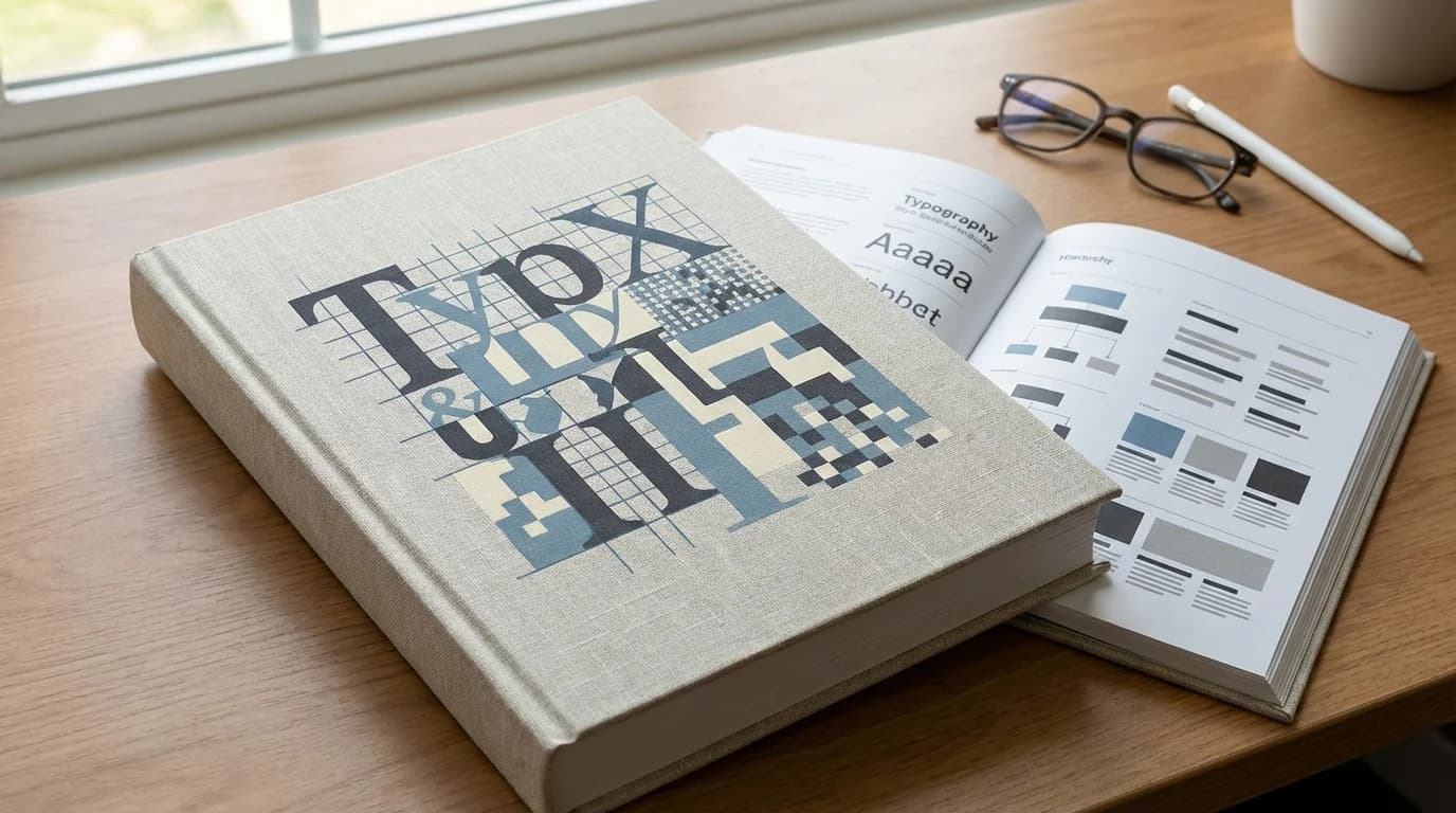
Principle 3: Design Systems for Consistency and Speed {#design-systems}
A design system is a collection of reusable components, governed by clear standards, that can be assembled to build any number of applications. It is the most important infrastructure investment a design team can make.
What a Design System Contains
- Foundations: Color palette, typography scale, spacing system, grid, motion principles
- Components: Buttons, inputs, cards, modals, navigation, tables — with documented variants and states
- Patterns: Common UI patterns (search, login, checkout) documented as guidance
- Documentation: Usage guidelines, accessibility notes, code implementation
Design System Benefits
- Consistency: Users learn your UI once; every interaction after the first is faster
- Speed: Designers assemble from components rather than designing from scratch; development uses the same component library
- Accessibility: Build WCAG compliance into components once; every instance inherits it
- Onboarding: New team members get up to speed by learning the system, not individual project conventions
Starting a Design System
You do not need to build a complete system before starting a project. Start with: 1. Color tokens (primary, secondary, neutral, semantic: success/warning/error) 2. Typography scale (6-8 sizes with clear hierarchy) 3. 8px spacing grid 4. Core components for your first project
Grow the system incrementally. A maintained simple system outperforms an abandoned comprehensive one.
Principle 4: Usability Testing Is Continuous {#usability-testing}
Usability testing is not a launch-gate activity — it is a continuous practice that should happen at every stage of design.
Testing Formats for Every Stage
Paper Prototype Testing (Concept Stage) Test information architecture and flow with sketched wireframes. Low fidelity means users focus on structure, not aesthetics. 5 users reveal 85% of major usability issues (Nielsen's Law).
Unmoderated Remote Testing (Mid-Fidelity) Tools like UserTesting or Maze allow you to gather task completion data from 20-50 users quickly. Identify patterns across a larger sample.
Moderated Sessions (High-Fidelity) For critical flows (checkout, onboarding, core product feature), invest in moderated sessions where a facilitator can probe for understanding behind behaviors.
Post-Launch Analytics + Session Recording Microsoft Clarity, FullStory or Hotjar session recordings on real users in production reveal interactions that controlled testing misses.
What to Test
- Task completion rate (can users accomplish the primary task?)
- Time on task (how long does completion take?)
- Error rate (how often do users make mistakes?)
- Satisfaction (Net Promoter Score, Single Ease Question)
- First-click accuracy (do users click the right element first?)
Principle 5: Content-First Design {#content-first}
Lorem ipsum is a design antipattern. Placeholder text hides the real constraints of your content and produces layouts that do not survive contact with actual copy.
Content-First Process
1. Define content requirements before designing components 2. Obtain real copy, even in draft form, before high-fidelity design 3. Design components that accommodate realistic content variation (short headlines, long headlines, truncated vs. expanded states) 4. Test layout with actual product photography, not placeholder images
Content Strategy for UX
- Microcopy: Button labels, error messages, empty states and confirmation text have outsized impact on conversion and trust. Invest in them.
- Readability: Use Flesch-Kincaid readability scoring. Complex language drives off users who read at the 8th-grade level.
- Voice and tone: Define how your brand sounds in moments of success, failure, onboarding and support. Consistency across all touchpoints builds trust.
Principle 6: Performance as a Design Constraint {#performance}
Performance is a UX problem, not just an engineering problem. Design decisions directly determine whether performance targets are achievable.
Design Decisions That Impact Performance
- Image count: More product images = more LCP risk. Use lazy loading and set explicit dimensions.
- Animation: Complex CSS animations and JavaScript-driven motion can push INP over 200ms. Use transform and opacity; avoid layout-triggering properties.
- Font selection: Every web font is an HTTP request. Limit to 2 font families; consider system font stacks for body text.
- Third-party embeds: Social feeds, maps, chat widgets, analytics scripts — each adds weight. Audit quarterly.
Performance Budget
Define performance budgets before development begins:
- JavaScript budget: max 200KB gzipped for initial load
- Image budget: max 500KB total for above-fold images
- LCP budget: max 2.5s on mobile 4G
- INP budget: max 200ms
Treat budget violations as design review failures, not engineering problems to solve later.
Principle 7: Data-Informed, Not Data-Driven {#data}
Data tells you what is happening but rarely tells you what to do. Treating data as the sole design input produces locally optimized but systemically broken experiences.
The Balance
- Data identifies problems: Low conversion rates, high bounce rates, form abandonment — data shows where friction exists.
- Research explains causes: Why are users abandoning the form? Data cannot answer this; interviews and session recordings can.
- Design intuition proposes solutions: Experienced designers know patterns that work; data validates which pattern works best in this specific context.
A/B testing is powerful but should test design hypotheses grounded in user research — not random button color changes.
Principle 8: Cross-Functional Collaboration {#collaboration}
Design that lives in a silo produces beautiful mockups that engineers cannot build, product managers cannot explain and users cannot find.
Design-Development Collaboration
- Involve engineers in design reviews to catch implementation complexity early
- Use component-based design (Figma components → React components)
- Annotate designs with interaction specifications, not just visual layouts
- Conduct joint design-development critiques before engineering begins
Design-Product Collaboration
- Designers should have context on business goals and constraints
- Product managers should have context on user research findings
- Shared metrics align both functions: conversion rate, task completion, retention
Design-Stakeholder Communication
- Present design in terms of user outcomes and business impact, not aesthetic choices
- Use testing data to support design decisions — removes personal preference from the discussion
- Make design process visible: share work-in-progress, invite early feedback
Learn about our collaborative design process →
Principle 9: Ethical Design {#ethics}
Design decisions have consequences beyond the screen. Ethical design considers the full impact of digital products.
Ethical Design Checklist
- Dark patterns: Never use manipulative UI to trick users into unwanted actions (hidden unsubscribe, pre-ticked consent boxes, misleading confirm-shaming)
- Privacy: Design privacy controls to be understandable, accessible and genuinely useful — not buried in settings
- Inclusive representation: Photography, illustrations and copy should represent the full diversity of your users
- Addictive patterns: Infinite scroll, variable reward notifications and other engagement-maximizing patterns have documented psychological costs — use with deliberate consideration
- Environmental impact: Heavier sites consume more energy; performance optimization is also an environmental choice
Principle 10: Iterative Improvement {#iteration}
No design is correct the first time. The teams that produce the best products are not the teams with the best initial designs — they are the teams that iterate most effectively.
Iteration Framework
1. Hypothesis: "We believe changing X will improve Y because Z" 2. Measure: Define the metric that proves the hypothesis 3. Test: A/B test or staged rollout 4. Learn: Analyze results with statistical significance 5. Decide: Roll out winner, or run another iteration
The cadence matters: teams that ship small improvements weekly outperform teams that attempt large redesigns quarterly.
Building Your Design Team Culture {#culture}
Principles only matter if the team lives them. Culture is the mechanism.
Rituals That Reinforce Design Principles
- Weekly design critiques: Every designer presents work in progress; structured feedback against principles
- User insight sharing: 15-minute slot in weekly team meeting for sharing user research findings
- Retros on shipped features: What worked? What did we learn? What would we do differently?
- Design principles review: Revisit your team's design principles quarterly; revise as you learn
Tools for 2025 Design Teams {#tools}
Design
- Figma: Industry standard for UI design and prototyping
- FigJam: Collaborative whiteboarding for workshops and journey mapping
- Framer: For high-fidelity interactive prototypes
Research
- Maze: Unmoderated usability testing at scale
- UserTesting: Moderated and unmoderated video sessions
- Dovetail: Research repository and synthesis
Analytics
- Microsoft Clarity: Free session recording and heat maps
- PostHog: Product analytics with session recording
- GA4: Core web analytics
Accessibility
- Figma Contrast: In-Figma contrast checking
- axe DevTools: Browser extension for automated accessibility testing
- NVDA/VoiceOver: Screen readers for manual accessibility testing
Conclusion {#conclusion}
The design principles in this guide are not 2025-specific — they are the foundations of effective design practice at any time. What changes is the context: new user expectations, new technologies, new performance standards. Apply these principles within that evolving context and your design work will compound in quality over time.
The Modern Web Design team applies these principles across every engagement. Our 750+ project portfolio is built on user research, systematic iteration and the conviction that good design is good business.
References
- Nielsen Norman Group — UX Research — Nielsen Norman Group
- WCAG 2.1 Accessibility Guidelines — W3C
- Google Material Design — Google
- MDN Web Docs — Mozilla